
Thursday, 27 September 2012
Embroidered tablecloth

Wednesday, 23 May 2012
Bosco Verticale


Tuesday, 7 February 2012
Elderflower Fields Festival 2012

Elderflower Fields is a new festival being organised in Sussex by some friends. I was asked to design the poster which was a fun project. If you fancy a weekend of music, sport, Sussex countryside, camping and dancing, sign up to their earlybird ticket line at www.elderflowerfields.co.uk. See you there!
Tuesday, 17 January 2012
Cards and colours for friends


Wednesday, 21 December 2011
Friday, 23 September 2011
Tree illustration

About eight years ago I planted a beautiful silver birch tree in the garden. When I look out of the kitchen window it is 'reverse silhouetted' against the dark green yew hedge beyond. It inspired this illustration.
Saturday, 17 September 2011
Dreaming of Springtime

Often, when I am dozing off to sleep, my mind skips through the day and all its visual feasts and, all on its own, comes up with a fresh new image. I keep a sketch book and pencil by my bed, quietly switch on the light and jot down the brand new image, delivered to my subconscious visual 'inbox' by an unknown and most welcome sender.
Minnows

We had a week at the end of August in Teesdale, Co. Durham. The children spent hours paddling and swimming (yes, really, despite the glacial temperature) in the river Tees and catching minnows. Here was one day's catch.
Fresh, summery newsletter design

Here is a recent job for Wakefields the Jewellers in Horsham. A summer newsletter, a printed version and an online page turning pdf version for their facebook page.
Take a look here.
Felt love
It has been a while...

I have been researching online for a design project. I love felt as a material. Not the colourful handspun, homemade variety but the solid thick, warm, insulating, industrial, crisp cut type of felt.
This image is courtesy of architectural practice i29

I have been researching online for a design project. I love felt as a material. Not the colourful handspun, homemade variety but the solid thick, warm, insulating, industrial, crisp cut type of felt.
This image is courtesy of architectural practice i29
Wednesday, 29 December 2010
White Christmas

Happy Christmas. (Yes, sorry it is a little late).
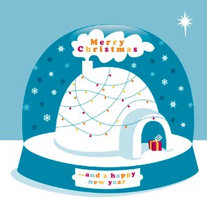
In the run up to Christmas this year everything seemed as if blasted by a cold, fresh, polar wind visiting early straight from the Arctic. On some days opening the back door felt like opening a door to a coldstore, the air often colder than that in my freezer. This year my christmas card has a polar theme, inspired both by the cool of winter and an image that has stuck in my mind of a polar bear drifting on the melting ice floe. Like a polar bear, none of us know what is ahead in the coming year. I hope that whatever leads you, be it a star, the wind or the daily tide of life, I hope that you will find a happy and warm place. A very happy new year to you all!
Wednesday, 25 August 2010
Stitched type


This proper old fashioned 'Champion Cokoernut Throwing Saloon' took my eye while visiting the Beamish Open Air Museum in County Durham last week. I love the hand stitched decorative type, the graphic border, the bunting and the faded colour as well as the words themselves. I asked the stall holder if it was an original as everything at Beamish is authentic (or nearabouts) to 1913. He said it was old and probably American due to the spelling of 'Cokernut'. He had a proper twinkle in his eye and rather kindly gave a little boy every chance to knock down a coconut by giving him many more than 3 shots for £1, and, a step closer each time he missed. Eventually, of course, the boy won his coconut. The sun shone (yes, really, even oop north) and the boy went off with a grin from ear to ear.
Thursday, 22 July 2010
Little Red Riding Hood
 Back in the winter when all was white and snowy, I drew this illustration inspired by my friends little daughter who always wore a little red coat with blond hair peeping out from the hood and cheeks made rosy pink by the freezing air. I was reminded of it yesterday when my friend was telling me about a new production at Glyndebourne of Hansel and Gretel. Her son is off to see it soon, and, as he is just 8, she had been explaining to him how traditional nursery stories often have a sinister edge to them. She was preparing him for some of the scenes as she did not want him to be shocked or terrified. Modern editions of nursery stories are often adapted and generally nowhere near as sinister as the original editions could be. These days our children need not be bothered by wolves prowling our neighbourhoods and eating their Granny alive - but we need to be mindful of our innocent little children being led off by a little mouse that clicks and leads them to another (and sometimes sinister) world called the internet...
Incredible Gardens - Identity Design

Incredible Gardens are a new concept in garden design. They have a solid background in agriculture and garden design and have a passion for all kinds of plants that have an edible element to them. Their mission is to design sustainable gardens that are beautiful and contain only plants that can offer something edible, be it a seed, root, leaf or flower.
My role was to design a contemporary logo that emphasised the strong design ethic that they base all their gardens on and that also hinted at the edible content of the planting choices. I have an interest in gardens and garden design and already knew that, on planting schemes, garden designers use a visual system for drawing groups of the same plants involving shapes connected by lines. For aesthetic reasons, there is a preference to plant groups of the same plants in numbers of 3, 5, 7 (etc). I borrowed this system as the base of the design and simply arranged a collection of 'plants' into a shape that resembles a bunch of seeds or fruits. These were set in a rectangle that represents the boundary of a garden.
Corporate Identity Design for Beverley Ogden Solicitors

 I was commissioned by a local Solicitor to revamp the image of the company and create a new logo to coincide with a move to new premises. The company is based in Lewes, East Sussex which is an old, and architecturally speaking, rather traditional county town. The company has been established for 25 years and is well known in the town I therefore opted for a clean and classic logo design which was applied to all new stationery and signage. The new office is just off the main High Street on a twitten (small pedestrian lane to you and me) and therefore it needed a prominent exterior sign. I also designed the interior signage and advised on the interior office layout and colour scheme.
Monday, 1 March 2010
Collectabilia
 Further to my haberdashery post, here is an attractive image. (I wish these tapes were in my collection!) I have been following the amazing collectionaday2010.blogspot.com the blog of illustrator Lisa Congdon. It is a great inspiration and a visual feast of a diary.
Thursday, 11 February 2010
Valentines day
 Birdsong is a beautiful sound that I have noticed loud and clear these last few mornings, despite the very wintry weather. The birds are heralding the arrival of Spring and it is a welcome and inspiring sound. They are calling out to potential and existing loved ones, and alerting others of their kind to food sources, predators, travels, nest sites and communal gatherings. Just the basic essentials of surviving life really.
I am sure that users of Twitter justify their involvement in it and the existence of it through believing that by contributing to it they are disseminating essential information, just the same as a bird in its song, but on a human level. I have always been of the cynical opinion that Twitter is of little long term or profound purpose. I guess that a very high number of tweets are banal, reactionary, egotistical and self publicising. However, that said, there are skills required to use Twitter - dedication, an opinion, making time to respond to others, stating your thoughts and feelings, 'following' others and finally, being yourself.
While drawing this, I imagined two people falling in love just by following each other on Twitter, entranced and captivated by the mundane nature of each others 'tweets'. This got me thinking. Maybe I could put my opinions of Twitter to one side and just for a Valentines Day moment, think of Twitter and other social networking tools differently. After all, we all know that surviving a relationship involves tolerating an awful lot of everyday boring stuff and not always with the soundtrack of beautiful birdsong. Just like reading Twitter. So, are the skills required to use and enjoy Twitter really just the ones that anyone in a relationship needs to survive beyond Valentines Day. Now, what about blogs…?
Thursday, 4 February 2010
The Shack Company new logo

 The Shack company is a new business creating handmade, oak framed, timber buildings. They commissioned me to create a new brand identity to suit a product which could sit happily in a 'rustic' or an 'urban cool' environment. I chose some earthy, natural colours with a contemporary orange zing and a chunky slab font called Blackoak. Not only is this font fit for purpose but, rather pleasingly, has a name that ties in quite neatly with the product on offer.
Friday, 29 January 2010
Haberdashery


 I have to admit that I have a strange obsession with all things 'haberdashery'. Last week my mother gave me these original packs of hooks and eyes and poppers and a huge box of buttons to rummage through. She has always been able to sew anything and always saved bits and bobs in case they are needed. My excitement was out of proportion to the gift. I will not be saving these for a sewing project - they are going to be framed!
Subscribe to:
Posts (Atom)